About 57% of consumers will spend more on a brand they feel connected to. Without a professional logo, you could struggle to connect new customers to your brand. Not many business owners know what it entails, though, which leads to unattractive designs.
Here are the key features of an eye-catching design to consider before designing one for your business. Read on to make smarter design choices for your company logo today!
Contrast
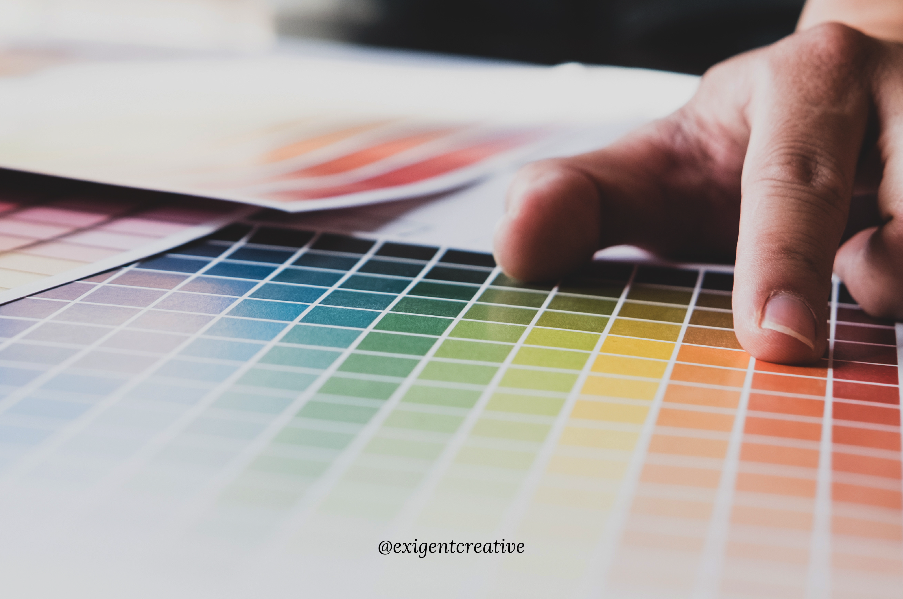
About 76% of leading brands have logos that contain only one or two colors. When designing one for your company, try to choose an analogous or complementary color scheme. Too many colors can make the design look messy.
Instead, choose colors that pair well together for a harmonious effect. A design that’s pleasing to the eye can help your logo appear grounded.
Make sure to choose colors based on your brand guidelines.
Balance
When designing, try to ensure each element balances with the other. When balanced, it will appear polished and harmonious. If something appears off-kilter, it becomes chaotic.
It can also become difficult for consumers to absorb information from your design.
Use a minimalistic design approach when creating your logo. If there are too many design elements, consumers won’t know where to look. Each element will compete for the consumer’s attention.
Keep symmetry, spacing, and alignment in mind when creating. If you’re finding it difficult to maintain balance, request professional logo design services. With help, you can create an eye-catching, well-balanced logo without stress.
Dominance
Allow one visual element to appear more prominent than the others. Creating a focal point will help you draw the consumer’s attention to your logo. It can also make your logo appear more dynamic and exciting.
Use white space to keep your logo from appearing too cluttered. White space will allow one element to appear more dominant as well.
Hierarchy
Your logo can inform consumers who you are, what you do, and who you’re trying to reach. Use hierarchy to draw the consumer’s gaze from one piece of information to the next.
You can use typography, colors, and framing to create a visual hierarchy.
Readability
When choosing fonts for your logo, make sure to prioritize readability over unique typography. Choose fonts that are both readable and well-friendly.
Readability will ensure people can absorb information. Otherwise, they might get confused and lose interest. If they have to work too hard to gain information from your design, you might lose a customer.
Design a Good Logo With Help Today
It can take experience and expertise to create a good logo that appeals to your target audience. If you want a professional one, request branding services this year. With professional design help, you can create a wow-worthy design that suits your business.
Ready to discover your new logo? We can help.
Contact us today to get started.


